Project Case Study
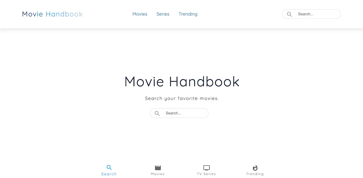
Movie Handbook
A movie discovery interface built with React and Material UI. You can search across movies, TV shows, and people, filter by genre, and pull up details without leaving the results page.
Overview
Movie Handbook is a discovery interface built with React and Gatsby. It connects to an external movie API and lets you search across movies, TV shows, and people, filter by genre, and open a detail overlay for any result without navigating away from the page. Material UI handles the component library and responsive layout.
Problem
Movie browsing can get overwhelming quickly. The challenge was letting users search, filter, and inspect results all in the same view without things feeling cluttered. Three search categories (movies, TV shows, people) needed to coexist in one interface without confusing the flow.
My Role
I built the React interface, connected the external API, handled the search and filtering logic, and put the responsive layout together using Material UI components.
Key Features
- Search across movies, TV shows, and people from a single interface.
- Genre filtering to narrow large result sets.
- Detail overlays that open over the results so users don't lose their place.
- Responsive layout built with Material UI.
Technical Decisions
- API calls trigger on search input and filter changes, so results update in real time without full page reloads.
- Search controls, filter controls, result cards, and detail overlays are separate components, each with their own concerns.
- Material UI gave consistent form control styling and spacing without having to build a component system from scratch.
- Result cards are intentionally minimal. Key metadata only, with expanded detail on hover or click.
Challenges Solved
- Unified three search categories into one interface without the switch between them feeling disruptive.
- Genre filters needed to stay visible and usable without pushing results out of view, especially on mobile.
- Different API result types (movie, TV show, person) have different fields, so the card component handles missing data gracefully.
- Detail overlays needed to feel like a natural extension of the result, not a modal that breaks context.
Technical Considerations
- Consistent card dimensions prevent the results grid from jumping around as new data loads.
- Filter and search controls use label elements and clear focus states so they work for keyboard users.
- API responses are normalized before rendering so messy or incomplete data never reaches the UI directly.
- The result grid uses responsive breakpoints so it works from a single column on mobile to a multi-column layout on desktop.
What I Would Improve Next
- Error, loading, and retry states for failed or slow API requests.
- Better keyboard navigation and focus management inside detail overlays.
- Persist active search and filter state in the URL so results are shareable.
- Empty state design for searches or filter combinations that return nothing.