Project Case Study
Beany House
A redesigned coffee shop storefront built with React and Gatsby. The shop page lets you browse and filter products by category (coffee, accessories, and equipment) with a clean product card layout and a polished ecommerce-style experience.
Overview
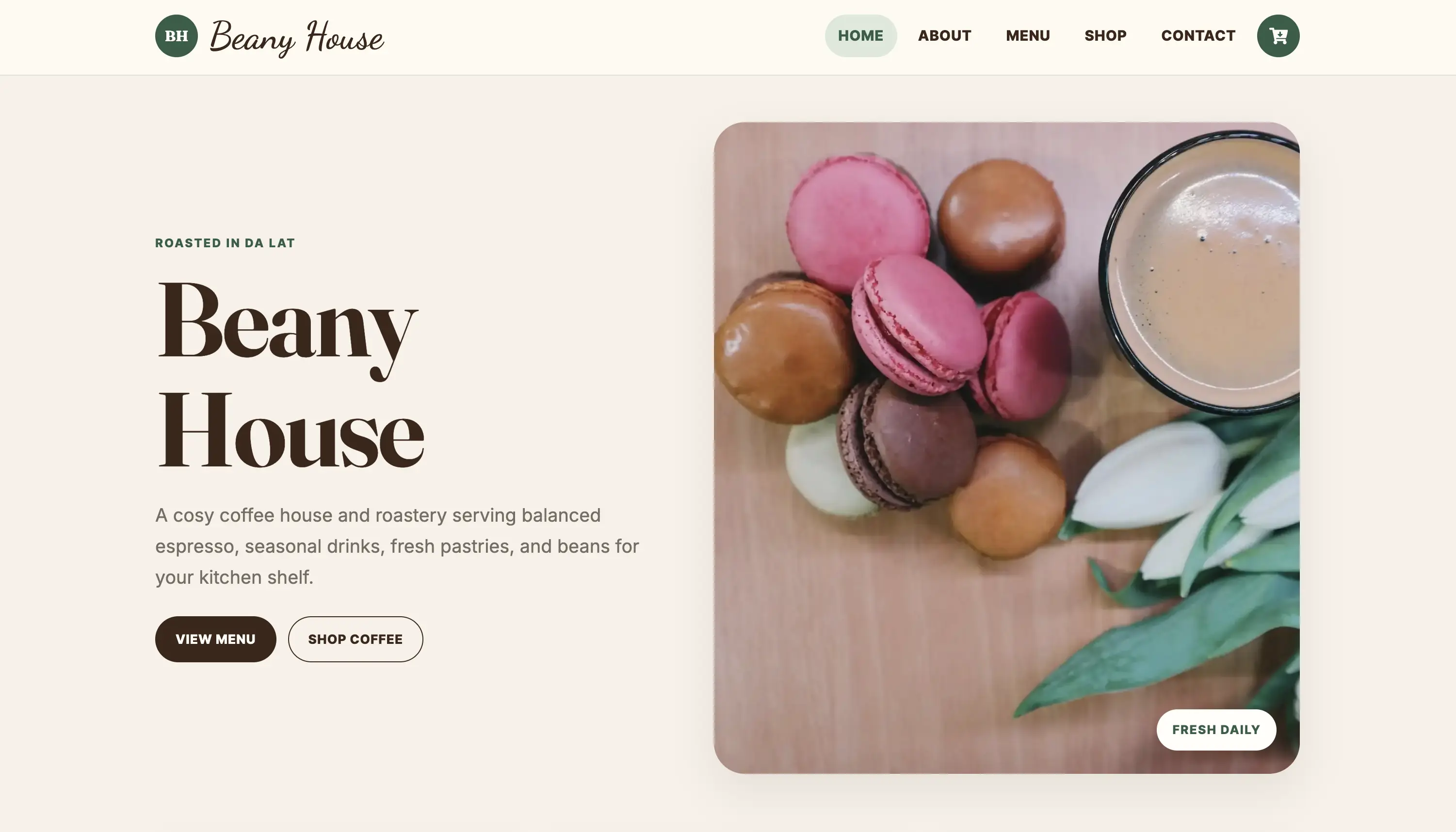
Beany House is a complete redesign of a coffee shop storefront, built with React and Gatsby and deployed on Netlify. The site covers a home page with feature sections and testimonials, a menu, a shop with category filtering and product cards, and a contact page. The redesign focused on visual clarity, consistent spacing, and an ecommerce-style product browsing experience that works well on any screen size.
Problem
The original site needed a ground-up redesign. The layout lacked visual hierarchy, the product browsing experience was unclear, and the overall feel didn't match a modern coffee brand. The goal was a cleaner, more considered frontend that put product browsing front and centre.
My Role
I designed and built the entire frontend. That meant rethinking the component structure, building the shop and category filtering from scratch, establishing a consistent visual language across pages, and making everything work across screen sizes.
Key Features
- Shop page with category filter tabs (all, coffee, accessories, equipment) and a responsive product grid.
- Product cards with title, description, price, and action buttons, consistent across all categories.
- Home page with hero section, feature cards, testimonials, and a product showcase.
- Responsive layout across all pages, designed mobile-first.
Technical Decisions
- Split the UI into focused React components (product cards, category filters, page sections), each scoped to a single concern.
- Gatsby handles static generation and Netlify deployment, so the site loads fast with no server-side runtime.
- Custom CSS kept mobile-first and scoped per component, without pulling in a UI library.
- Category filtering handled client-side in React so switching tabs is instant with no network request.
Challenges Solved
- Establishing a consistent visual language across the home, menu, shop, and contact pages during a full redesign.
- Building product cards that stay visually uniform despite products spanning very different price points and descriptions.
- Making category filter tabs and the product grid work cleanly on narrow screens without layout shifts.
Technical Considerations
- Static Gatsby pages mean fast initial load with no client-side data fetching for product content.
- Mobile-first CSS ensures the shop grid, filter tabs, and product cards are usable before desktop styles layer on.
- Semantic HTML and clear visual labels keep the shop browsable for keyboard users.
- Consistent card dimensions prevent the product grid from jumping around between categories.
What I Would Improve Next
- Add a working cart and checkout flow.
- Individual product detail pages with larger images and full descriptions.
- Empty state for filter categories with no results.
- Improved focus management when switching filter tabs.